Sometimes (very often) I am too lazy to cook, so I order. I don’t mind a walk, so typically, I place the order, go to that place, and either pick it up or dine in.
I frequently order food from a local chain specializing in traditional cuisine called La Placinte and this text is going to be about my experience using their website.
Initial Website Impression
Despite having visited the website numerous times, I’ll try to describe my feelings as if I were seeing it for the first time.
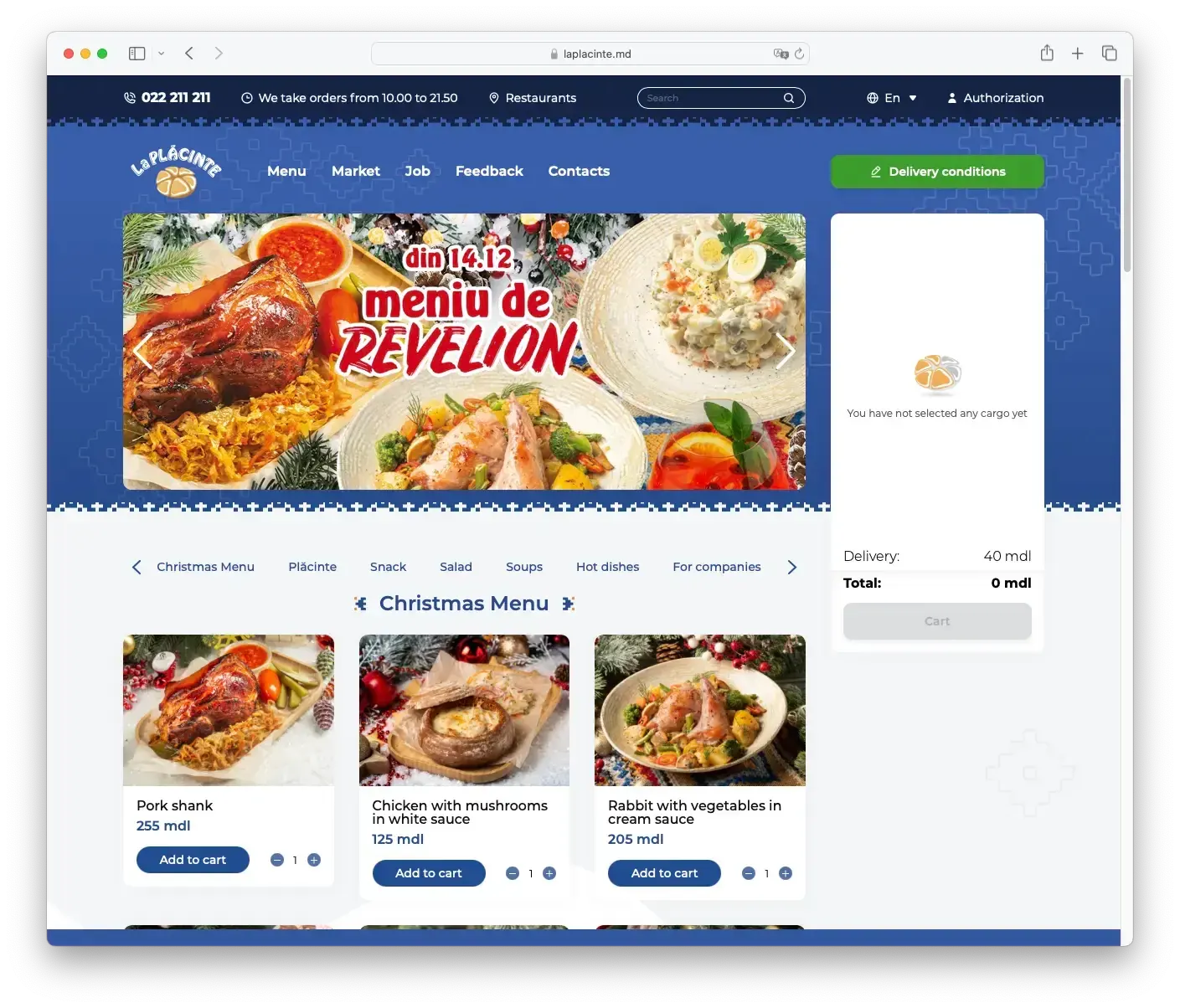
My first impressions, once the website’s finally loaded, are positive. The design is visually pleasing. There’s an image for every dish, which is great plus - helps picking.

The carousel
After some time, a bold detail stands out—the carousel. The reason why it stands is the speed with which the images are switched. Users are given only 3 seconds to read the contents of the image. They cannot stop it by hovering the mouse or by holding the click. The only way is to switch the slide and then change it back:
When you switch to the next slide, the autoplay finally chills, and you can catch up on what’s happening there. Maybe the plan was to show only images with simple subjects. It would still be too little time, especially to read the announcement with a smaller font.
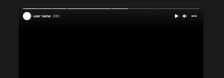
As an alternative, I would increase the time to 5 seconds and add the ability to stop the playback. If I were to point out an example, I would give Instagram stories:

Not only does it allow you to pause the playback by holding, but you can also do it using the play/pause button. The indicator at the top enhances the interface’s predictability—users see the filling bar and understand when the slide will switch.
The categories
I found out that you can scroll through the categories by dragging them (which is a good idea, especially for mobile). However, there’s one catch:
When I drag the list and release, it just bounces back, moving only to the next category. This implementation is a real letdown. It’s like torture for the user, and honestly, I’d rather disable dragging altogether than putting someone through this.
The sliding behavior doesn’t necessarily require the use of too much JavaScript (I can see it’s there, since it has a complex behavior). Creating a long scrollable element would be enough. This approach would work seamlessly, and the browser itself would ensure appropriate behavior. It’s like using a supercomputer to solve a simple 3rd-grade problem—a bit of an overkill.
“Add to cart” button
The quantity picker and the “Add to cart” button are present on every product card. I’m not a fan of the quantity picker in this place. I get the idea – pick a quantity and then hit “Add to cart.” But in reality, it introduces more confusion than value.
Why go through the hassle of clicking the ”+” button ten times and then hitting “Add to cart” when you can just click “Add to cart” ten times with one less click? You might argue: What if you want to add 10 items 10 times? I believe people wanting to order that much food would rather do it by phone.
Ordering
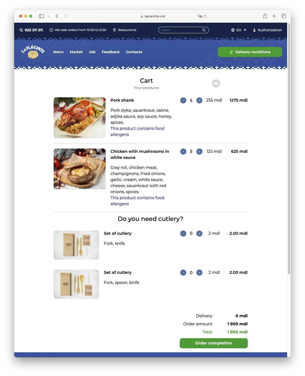
Let’s say you’ve picked the products you like and are ready to place your order. Click the “Cart” button, and voilà, the order page unfolds.

Here again you encounter the quantity picker in the cart. It’s fine here; it might come in handy if you accidentally press an extra time while browsing. Having a quantity picker on the cart page provides an additional reason to remove the same picker from the product card.
Adding cutlery
I run into a different set of issues in the cart. First off, let me describe the behavior when attempting to add cutlery:
Why does it move 😄? I can see that cutlery is in its category with 0 items, so was performing that movement of the line that necessary? Somehow, the developers (or designers) felt the need for this separation and decided to update the layout of the cart.
Updating the layout creates another problem as you might have already noticed. The page does not seem to understand when the user finishes clicking on the + button and updates the page too early. So, if you are too slow (or have cold fingers), you won’t be able to add more than one set of cutlery (you need some skill to add the exact number of items).
(I’ll overlook the fact that when I wanted to add 3 sets, it somehow ended up being 6).
The next question, also related to cutlery: Why can’t the cutlery be inferred from the order? If I have soup and need cutlery, it’s obvious that I’ll need a spoon and won’t need a knife. If I have 5 soups and want cutlery, why not simply infer that I need 5 spoons?
What the developers/designers did was toss another responsibility onto the user, making the ordering process even more cumbersome.
(I understand that this might be the restaurant’s policy regarding cutlery, but I’m not a fan of it.)
Order completion button
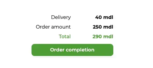
Towards the end of the page, there’s the “Order completion” button. The confusing part about the label is that right above it; there’s the Delivery price:

When my girlfriend wanted to make a preorder and pick it up from the restaurant, she was confused and concerned, and it’s no wonder why.
A bit lower, there’s the “Order completion” button. Once you press it, you move on to the next step of the cart wizard, which is delivery and payment. Perhaps a clearer name could be “Delivery and Payment” or “To Delivery and Payment.” Taking a cue from Amazon, “Proceed to Checkout” might be an even better option.
In the delivery section, there are a couple of inputs that the user needs to fill in. What’s interesting is the user has to enter their phone number twice.
The rationale behind entering the phone number twice seems a bit odd. While it makes sense for passwords, typically hidden, with a phone number, the user can see it and correct if needed.
How addresses work
The intriguing part about this functionality relates to “Authorisation.”
Once you decipher that “Authorisation” means logging in and is not a link for admins (the next worst name candidate for the log-in button would probably be “exchange your credentials for a token”), you can add an address.
“Cool,” thought I, “now I can have an account so I won’t ever need to complete my details again”. I filled in my details and added an address. However, I still have to enter my name, phone (twice), and email during the checkout!
To be fair, they do provide the option to select an address from those you’ve added, so creating an account isn’t entirely useless.
Conclusion
I genuinely like this restaurant. I wouldn’t bother writing this text if I didn’t.
I appreciate the positive aspects of this restaurant, including the pleasant atmosphere and friendly staff (they once even congratulated me on my name’s day).
But the website isn’t making my experience as enjoyable. What’s particularly sad for me is that the issues I’ve pointed out are not difficult to fix, yet for some reason, they remain unaddressed (perhaps because they go unnoticed).
I’m sharing this article, not just to criticise (although I do enjoy it😈), but in the hope that someone who can make things better will see it. Or perhaps if you’re planning to build a website for a restaurant, you won’t make the same mistakes. I look forward to a time when ordering online is easy, and I don’t have to type in my phone number twice.
PS: If you need inspiration for better experience, check out Straus. They don’t require users to enter their phone twice, since the “Authorisation” happens by entering a code, received as SMS. Also ordering food from them is super easy.